Using Aspect Ratio Lock On Responsive Global Assets

Use Aspect Ratio Lock to easily and effectively scale responsive global assets across multiple sizes.

You can set a responsive global asset in a design to either have their aspect ratio Locked or Unlocked. The Aspect Ratio settings for that asset can be found in the Size and Position panel.

When the aspect ratio of the responsive global asset is Locked, the asset’s aspect ratio remains the same as you resize the bounding box. With aspect ratio Locked, you can use the Fit and Fill settings in the Size and Position panel to crop your asset. Unlocking the aspect ratio of a responsive global asset with a Locked aspect ratio will stretch the element to all edges of the bounding box.

For more information, check out our article Aspect Ratio of an Element.

Save Time With Keyboard Shortcuts

Whether you’re looking to select multiple objects, bring a layer forward, or align an element – keyboard shortcuts make building designs in Flexitive faster.

For a full list of Keyboard Shortcuts, check out our article Keyboard Shortcuts.

Some example keyboard shortcuts:
For Windows users, use the Ctrl key instead of Cmd.

Keyboard Shortcuts
Keyboard Shortcuts


Add A Grid Overlay To Your Design

Use the grid feature in Flexitive to easily organize the elements on the canvas.

You can easily modify the grid overlay in Flexitive and change the color so the grid stands out from your design. You can also set the number of rows and columns, which is particularly useful when uploading designs to platforms that have text proportion restrictions i.e Facebook.

To learn more, check out our article on Turning on a Grid Overlay.

Deeper Dives with Flexitive Design Cloud Tutorial Videos

Flexitive Deeper Dives tutorials provide you with in-depth coverage of topics such as Text and Webfonts, Video Components and the Carousel Widget. You’ll learn about all aspects of text in your design, uploading and embedding videos, and different Carousel Widget options.

Deeper Dives:

Text & Webfonts

Learn more about formatting text boxes or specific words/characters within a text box (inline text). Access 700+ free web fonts and over 20,000 paid fonts, or how to upload your own custom font. Also, more advanced text options like scrolling text.

Video Components

Learn how to upload videos to Flexitive Design Cloud and add them to a Flexitive HTML5 page, or embed a Youtube video. Customize playback options like autoplay, show/hide controls etc. with no coding.

Carousel Widget

The Flexitive Carousel Widget allows you to quickly add images or videos into a rotating responsive carousel.

  • Set it to swipe left/right (via mouse or touch!)
  • Change the type of transition animation between slides

For more videos and Flexitive Design Cloud Tutorials – Essentials check out our YouTube Channel youtube.com/flexitive.

If you have a request for a tutorial video, reach out to us at support@flexitive.com.

Work on Multiple Designs Simultaneously

With Flexitive for Desktop on Windows and Mac, you can view and edit multiple designs at the same time.

Viewing and editing multiple designs is particularly useful when working with embedded pages, copying and pasting text from one design to another, and when comparing different versions of designs.

You can download Flexitive for Desktop at Flexitive.com/apps.

Using The Right Click Menu

You can use the right-click menu in Flexitive to quickly and easily adjust element settings on your design, allowing for a quicker and more efficient workflow.

With the right-click menu you can;

  • Reorder the elements position in the layers,
  • Change the size and position of an element on a certain size,
  • Hide, show, and delete elements,
  • Flip an element,
  • Snap to All Edges,
  • Add animations,
  • Add click-through URLs,
  • Replace elements.

Simply right-click on any element to view the right-click menu.

Learn the Essentials with Flexitive Design Cloud Tutorial Videos

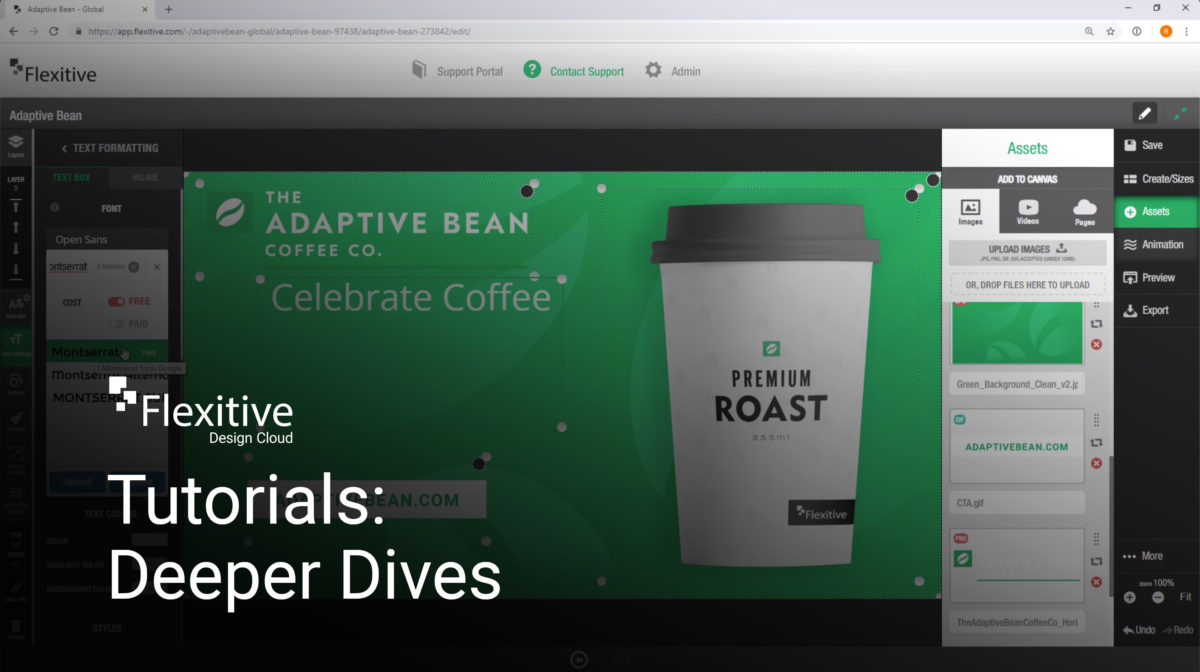
Flexitive Design Cloud Tutorials are a quick and easy way to learn how to build designs in Flexitive.

In minutes, you can learn about the basics of Flexitive, from creating your first size, adding animations, exporting designs and more.

Flexitive tutorials are handy when onboarding a new team member or for a quick refresher.

Flexitive Tutorial Videos:

  1. Creating Your First Size

You can learn how to build your first size in Flexitive.

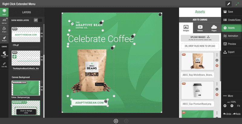
  • Dropping your high resolutions assets (jpg, transparent png, gif, mp4 etc) to the canvas
  • Setting a background color and image
  • Cropping assets
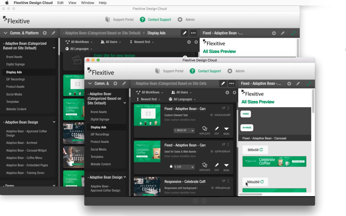
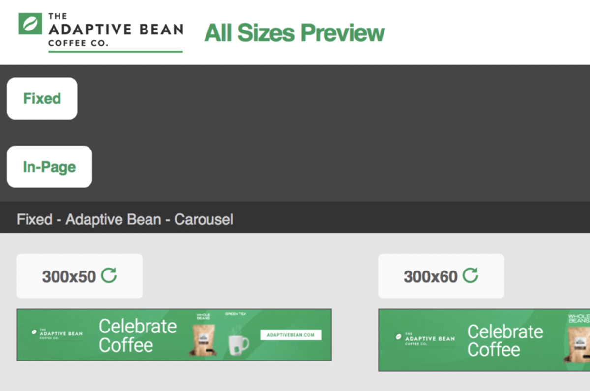
  1. Activating Unlimited Sizes

You can learn how to create a single design that adapts to unlimited sizes – whether specific fixed sizes, full-screen sizes or fully responsive designs!
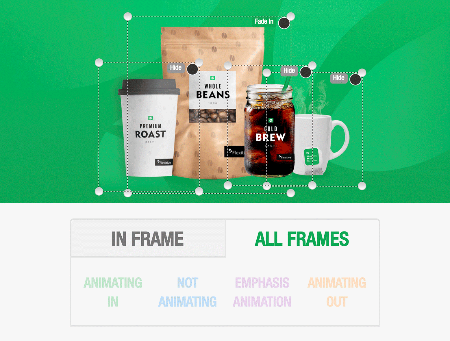
  1. Animate Your Design

Learn the basics of animation in Flexitive.

  • Adding keyframes
  • Choosing an animation for each element (applies across all sizes)
  1. Generate Live Preview Pages

Learn how to generate a live preview page URL that you can send to anyone for feedback or approvals.

  1. Exporting a Design for any Size & Channel

Learn how to export your design for any size, channel and file format. Flexitive automatically optimizes your images for each size, and even optimizes code so that it works everywhere.

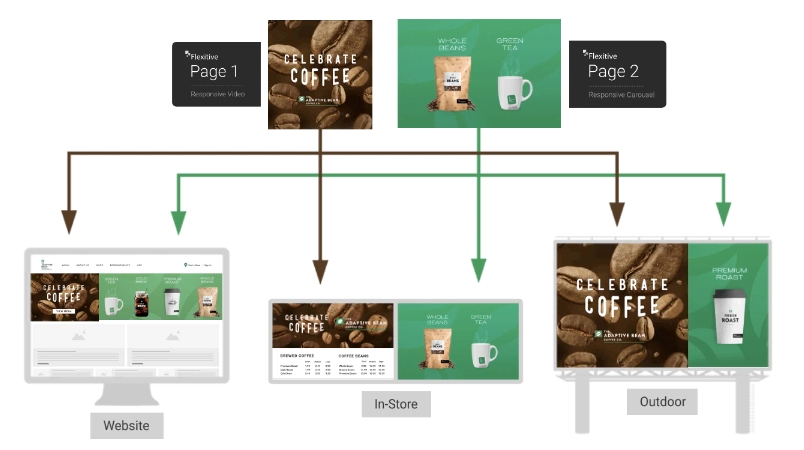
  1. Making Design Variations Fast

Learn how to create more design variations really fast.

  • Swap an asset (eg image, video etc) with any other asset, that will change across all sizes.
  • Change an animation in one click (that applies on all sizes instantly).
  • Generate a live preview page of your design variation.

For more videos and Flexitive Design Cloud Tutorials – Deeper Dives check out our YouTube Channel youtube.com/flexitive.

Branded Preview Pages

Preview Pages allow you to share the most up-to-date version of your design with anyone, improving your workflow visibility and streamlining the approval process. If you save a change to your design in Flexitive, the change will be visible on the preview page after you refresh the change.

Branded Preview Pages include your company logo on your Preview Page, a custom URL, and completely removes Flexitive branding.

Branded preview pages are available on Enterprise subscriptions.

To add a branded preview to your site, reach out to your account manager.

Learn more about Branded Preview Pages.

Make Changes Across All Designs & Channels with Responsive Embedded Pages

Save time and maintain consistency by incorporating a responsive Flexitive design as an Embedded Page within another Flexitive design. You can then instantly update design elements across unlimited sizes, designs and channels by editing the Embedded Page.

Flexitive responsive designs can be used as global assets and embedded across many different designs. Embedding a Flexitive design as an asset, allows you to update page components centrally, which will update across all the parent designs they are in. These different parent designs may be used for lots of different types of communications (eg. website content components, digital signage, social posts etc). This saves so much time!

Pages can be as complex (eg multiple images/text that are fully animated) or as simple as you like (eg responsive versions of a logo). Embedded pages can be fully responsive, or any fixed aspect ratios that you would like.

Check out our Flexitive Tutorial Video on Responsive Global Assets to learn more.

Filter What Elements You See When Animating Your Design

A key part of using animations in Flexitive is knowing exactly what is happening in each frame.

When working on a design with an animation sequence, you’ll have the option of filtering the elements that are visible on the canvas by animation state.

In the Animation Panel, you can toggle between the ‘All Frames’ tab to view all elements of your animation sequence at once, and ‘In Frame’ tab to view only the elements that are visible on a specific frame.

Filtering what elements you see when animating your design is particularly useful when working on a complex design with lots of elements or complicated animations, as it can help you to quickly identify any changes you want to make to your animation sequence.

Learn more about the ‘Show Elements on Canvas’ tabs.