Use Aspect Ratio Lock to easily and effectively scale responsive global assets across multiple sizes.
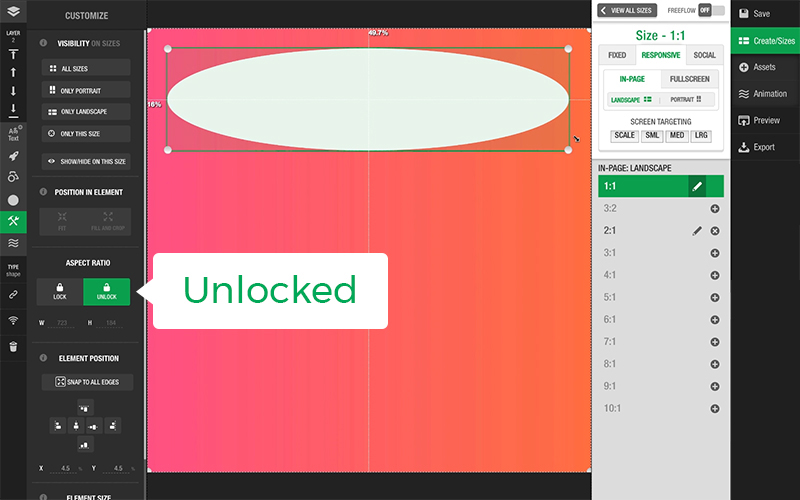
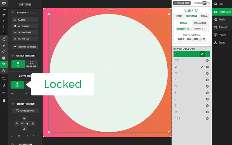
You can set a responsive global asset in a design to either have their aspect ratio Locked or Unlocked. The Aspect Ratio settings for that asset can be found in the Size and Position panel.
When the aspect ratio of the responsive global asset is Locked, the asset’s aspect ratio remains the same as you resize the bounding box. With aspect ratio Locked, you can use the Fit and Fill settings in the Size and Position panel to crop your asset. Unlocking the aspect ratio of a responsive global asset with a Locked aspect ratio will stretch the element to all edges of the bounding box.
For more information, check out our article Aspect Ratio of an Element.