Make Changes Across All Designs & Channels with Responsive Embedded Pages

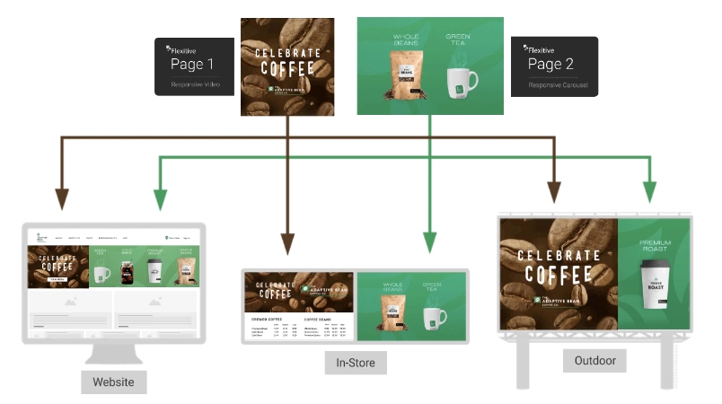
Save time and maintain consistency by incorporating a responsive Flexitive design as an Embedded Page within another Flexitive design. You can then instantly update design elements across unlimited sizes, designs and channels by editing the Embedded Page.

Flexitive responsive designs can be used as global assets and embedded across many different designs. Embedding a Flexitive design as an asset, allows you to update page components centrally, which will update across all the parent designs they are in. These different parent designs may be used for lots of different types of communications (eg. website content components, digital signage, social posts etc). This saves so much time!

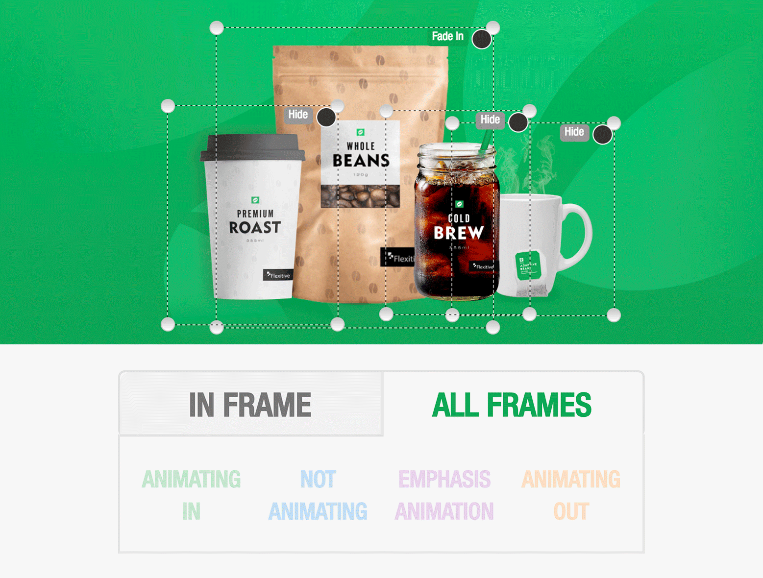
Pages can be as complex (eg multiple images/text that are fully animated) or as simple as you like (eg responsive versions of a logo). Embedded pages can be fully responsive, or any fixed aspect ratios that you would like.

Check out our Flexitive Tutorial Video on Responsive Global Assets to learn more.

Filter What Elements You See When Animating Your Design

A key part of using animations in Flexitive is knowing exactly what is happening in each frame.

When working on a design with an animation sequence, you’ll have the option of filtering the elements that are visible on the canvas by animation state.

In the Animation Panel, you can toggle between the ‘All Frames’ tab to view all elements of your animation sequence at once, and ‘In Frame’ tab to view only the elements that are visible on a specific frame.

Filtering what elements you see when animating your design is particularly useful when working on a complex design with lots of elements or complicated animations, as it can help you to quickly identify any changes you want to make to your animation sequence.

Learn more about the ‘Show Elements on Canvas’ tabs.

Adding Custom Templates

Custom templates are the perfect starting point when building a campaign in Flexitive and allow you to quickly build a campaign in minutes. You can easily add custom templates to your account using an existing Flexitive design or by building a new design.

Custom templates can be built specifically to your brand guidelines and vastly reduce the design time of your project as they require little modification.

You can also design your custom templates by categories, for example, a custom template for vacations, automotive, and dining.

Whenever you start a new project in Flexitive, your custom templates will be available in the Template Selection Screen.

Custom Templates are available under Enterprise subscriptions. Reach out to your account manager or support@flexitive.com to set up your custom templates.

Check out our article Using a Flexitive Template for more information.

Export Anywhere

With Flexitive, you can export your animated HTML5 designs in a variety of different ways. Choose the export option that bests suits the platform you’d like to display your designs on and the audience that you’d like to reach. Once exported, you can then display your animated HTML5 designs on ad servers, websites, digital signage, social platforms, and more.

Ad Servers
You can export your HTML5 file package as a ZIP file or live ‘tag’, and the latest ad server code will be automatically added to your file. Live designs exported directly from the Flexitive Design Cloud reflect changes instantly. Flexitive currently supports over 40 of the leading ad servers and is constantly adding more.

See the full list of Flexitive supported ad servers here.

CMS
Exporting your design for CMS allows you easily host your design in an iframe, or as a generic HTML5 ZIP with no tracking information for ad servers. Export your designs for CMS when you want to use your Flexitive design as an element on your website.

Learn more about exporting your designs for CMS here.

Digital Signage
With Digital Signage you can display your Flexitive designs on any sized screen, across stadiums, conference stands, menu boards, and more. Digital Signage requires a flexible design that can to adapt to any screen. Since fixed size designs cannot do this, it is recommended that designs for Digital Signage be built to be fully responsive.

For more information, check out our article on Building a Design for Digital Signage.

Social Media
Most social media platforms do not accept HTML5 design uploads, so when you export your design for social media you should export static JPEG images or as a video export.

For more information on exporting, check out our Flexitive Tutorial Video Exporting a Design.

Do More with Carousel Widget Transitions

The Carousel Widget is an easy and fun way to showcase hero images on your website, multiple products in your ads, upsell options at your point-of-purchase and more.

Expand your creative options by using different Carousel Widget Transitions and directions, such as Slide Up/Down or Flick.

The Carousel Widget can also be built to be fully responsive, so you can use the same widget on any size in your design project and it will still look good.

Check out our Flexitive Tutorial video on Carousel Widgets for a full guide on adding a Carousel Widget to your design.

Control Element Visibility to Scale Your Design Faster

In Flexitive, when you add a new element to your design, that element will be added to all activated sizes. By adding your elements to all activated sizes, Flexitive makes the entire design process shorter.

When editing a size, you can choose what sizes you want a newly added element to appear on. Using the Visibility settings in the Customize Panel, you can set an element to hide an on a particular size, on all other active sizes, or by portrait and landscape orientation.

You can see the elements you’ve hidden on your canvas using the ‘Show Hidden Layers’ toggle in the Layers panel.

For more information, check out our article on Element Visibility.