5 Graphic Design Essentials for 2022

Interactive Elements & Animations

Engaging consumers through motion and animation. Static graphics don’t always cut through the noise. With the increase in digital platforms, brands can use motion in design to better the way they approach storytelling and deliver memorable experiences to customers.

Accessible Designs

Have you ever increased the font size on your phone or in your browser? You’re benefiting from an accessibility feature. Accessibility design fundamentals such as color contrast, font size and defined heading structures have been around for years. Now, brands and their agencies must focus on improving digital accessibility further. Designers should ensure elements are available for screen readers through adding image descriptions, determining the tab navigation order, and enabling text scaling to name just a few. Flexitive has each of the features built-in, so you can easily ensure all of your designs meet accessibility requirements.

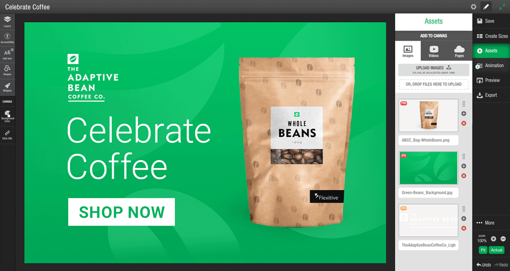
Reusable ‘Global Assets’

Global brands operating across the world often have a huge number of design elements and lock-ups to meet certain market requirements. One of the best ways to avoid repeating work and to ensure consistent brand experiences is to develop reusable components or ‘Global Assets.’ When you make updates to a Global Asset, the asset will instantly update across other designs where it is embedded. Now just think of those extra hours you’ll have back!
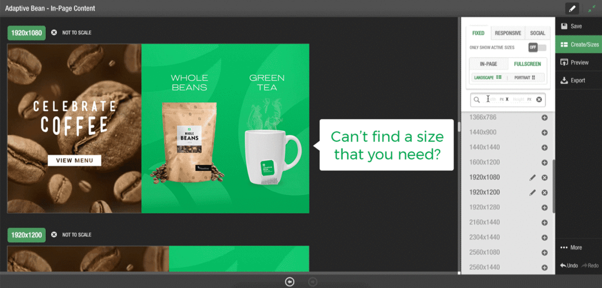
Expandable Designs

Busy lives, shorter attention spans and information overload has made it more difficult for marketers to compete for people’s attention. Expandable designs provide the opportunity for designers to communicate a message in a more interactive format. Clearly display the key information on the part of the design visible and allow your audience to click to expand either within a design or outside of the fixed size.

Illustrations and Colorful Icons 

Illustrations allow an audience to interpret their own meaning, while icons convey a message quickly and clearly. Both act as powerful visual communication tools for designers and marketers. Icons and illustrations are also vital for accessibility as they provide visual cues for disabled visitors.


If you’re ready to start incorporating some of these design essentials, request a Flexitive Enterprise Demo and our solutions team will contact you to arrange a time.

Want to learn more about design automation? Visit flexitive.com
Questions? Contact us to get in
touch!

Choosing the Best File Types for Web Image Optimization

It’s super important to consider web image optimization when creating designs, and choosing the best file types to use for individual elements. Even though Flexitive makes this process easier with automated image resizing and smart compression, we’ve put some tips together to help designers identify the best file types to use when building static, or animated designs that are both high quality, and load quickly on all devices.

JPG

  • Best for realistic photo compression (i.e. mountain landscapes), or complex static designs
  • Images with solid color bands (illustrations) can also be exported as JPG if they have many colors and are complex.

PNG-24

  • Best for images with transparency that also have your asset sitting above various colors. Great for product images that have transparent backgrounds, within HTML5 content.
  • PNG-24 is also a good alternative to assets that would otherwise be in SVG format since they offer more compression. However, the downside is that you have to make sure the image resolution is high enough for your purposes.

PNG-8

  • Best for images with fewer colors and solid color bands.
  • PNG-8 is also a good alternative to assets that would otherwise be SVG format since they offer more compression. However, the downside is that you have to make sure the image resolution is high enough for your purposes.
  • Is similar to GIF in that you must have a “matte” around your asset if there is transparency, but it greatly reduces file size.

GIF

  • Great for animated images within emails, or for memes!
  • The best way to create and showcase simple, short animations. Keep in mind, the file size may escalate quickly!
  • Best for images with solid color bands (illustrations), not for images with many colors eg. gradients.
  • GIFs are also a potential alternative to assets that would otherwise be SVG format since they offer more compression; however, the downside is that you have to make sure the image resolution (pixel size) is high enough for your purposes.
  • Like PNG-8, requires a “matte” around your asset if it is transparent, but you can achieve smaller file sizes.

SVG

  • The best format for vector shapes/illustrations/text/ because it offers infinite scaling without loss of quality. Use SVGs for high-resolution screens such as 4K+, if the image will be within HTML5 content.
  • If your vector is too complex (too many curves/vertices) and requires transparency then it would be best to save a large-resolution PNG-24.
  • Keep in mind that SVGs do not compress – they are one file and file size regardless of their physical dimensions. If there is a lot of text in your SVG or you are creating a button for a CTA and are worried about file size – consider using an auto-resizing text element within Flexitive rather than uploading an SVG.

To learn more about design automation visit flexitive.com or if you have any questions contact us to get in touch. 

If you work for a brand or agency, request a Flexitive Enterprise demo and our solutions team will contact you to arrange a time.

If you found this post helpful, please share using the icons below!

The 80/20 Rule Applied to Digital Production

Each week I have anywhere between 10-20 conversations with marketing, creative, and ad operations leaders. These posts contain what I’ve learnt about current challenges in the industry, solutions, and ideas. No brand or names will be mentioned for privacy purposes. 

Developers are immensely valuable. In fact, they’re probably one of the most in-demand professions right now. 

They are highly paid, smart, and in my experience, always looking for new challenges. 

So why do brands & agencies often waste their developer’s talents?

This topic came up recently when I was sitting down with a Technology Director & Creative Director.

During our conversation, they mentioned that it wasn’t scalable for their developers to be hand-coding simple HTML5 designs. 

The Creative Director was frustrated that his team couldn’t turn around their work fast enough without going through the technical team. There simply weren’t enough resources available to keep up with demand.

Not to mention their team was spread across the country, causing a communication disconnect and slow production times. 

The Technology Director was frustrated that his team didn’t have the time or resources to engage in complex projects, and with more clients requesting personalized variations, their workload was always growing. 

The conversation eventually turned to the reason we set-up this meeting. 

How much of the overall work could be streamlined so that the non-technical creative team members could create HTML5 designs?

We came down to an 85/15 percent split. 

Both the Creative Director and Technology Director agreed that 85% of their HTML5 development work could be switched to a platform and streamlined, allowing/freeing up time for creative team members to create HTML5 designs.

The Creative Director was satisfied because he could enable creative and production team members to create HTML5, animated designs. 

The Technology Director was satisfied because he could engage his team with complex projects and keep them highly motivated.

It’s similar to the 80/20 rule — you just need to find how to leverage it.

If this hit a pain point for you let me know. I continually work with teams to solve these types of problems. Contact me at marty@flexitive.com.

Adding Custom Sizes

You can add any custom size that you require to your Flexitive account. When you add a custom size, it’s added to every design in your account, so they’ll always be available to all users within your account.

By default, you’ll have access to a wide variety of responsive, fixed and social sizes to build your designs with. See a full list of all the default sizes available in Flexitive.

Filtering & Adding Custom Sizes:

  1. Filter Sizes:
    You can search for your required size by entering the width and height in the filter option in the Sizes Panel.

Filtering Sizes
Filtering Sizes


2. Add a Custom Size:
If a size you searched for is not available, you can add the size by selecting the button ‘+Add Size for all users).

custom size
Custom Size


Zoom and Crop Flexitive Elements

Reduce the time you spend preparing assets outside of Flexitive and maximize the potential of your assets with Zoom.

Zoom is particularly useful when working with images across a wide variety of sizes. With Zoom, you can focus on a specific area of an image and easily create variations of your image across all of your different sizes in your design.

Apply Zoom to an Image

To apply Zoom to an image, select the image and open the Size and Position Panel on the left-hand side. Ensure the Position of Element is set to Fill and Crop. You can then use the Zoom Slider to zoom in or zoom out of your element.

See our article Fit, Fill and Cropping, & Zoom for more information. 

Save Time With Keyboard Shortcuts

Whether you’re looking to select multiple objects, bring a layer forward, or align an element – keyboard shortcuts make building designs in Flexitive faster.

For a full list of Keyboard Shortcuts, check out our article Keyboard Shortcuts.

Some example keyboard shortcuts:
For Windows users, use the Ctrl key instead of Cmd.

Keyboard Shortcuts
Keyboard Shortcuts


Add A Grid Overlay To Your Design

Use the grid feature in Flexitive to easily organize the elements on the canvas.

You can easily modify the grid overlay in Flexitive and change the color so the grid stands out from your design. You can also set the number of rows and columns, which is particularly useful when uploading designs to platforms that have text proportion restrictions i.e Facebook.

To learn more, check out our article on Turning on a Grid Overlay.

Work on Multiple Designs Simultaneously

With Flexitive for Desktop on Windows and Mac, you can view and edit multiple designs at the same time.

Viewing and editing multiple designs is particularly useful when working with embedded pages, copying and pasting text from one design to another, and when comparing different versions of designs.

You can download Flexitive for Desktop at Flexitive.com/apps.

Using The Right Click Menu

You can use the right-click menu in Flexitive to quickly and easily adjust element settings on your design, allowing for a quicker and more efficient workflow.

With the right-click menu you can;

  • Reorder the elements position in the layers,
  • Change the size and position of an element on a certain size,
  • Hide, show, and delete elements,
  • Flip an element,
  • Snap to All Edges,
  • Add animations,
  • Add click-through URLs,
  • Replace elements.

Simply right-click on any element to view the right-click menu.

Make Changes Across All Designs & Channels with Responsive Embedded Pages

Save time and maintain consistency by incorporating a responsive Flexitive design as an Embedded Page within another Flexitive design. You can then instantly update design elements across unlimited sizes, designs and channels by editing the Embedded Page.

Flexitive responsive designs can be used as global assets and embedded across many different designs. Embedding a Flexitive design as an asset, allows you to update page components centrally, which will update across all the parent designs they are in. These different parent designs may be used for lots of different types of communications (eg. website content components, digital signage, social posts etc). This saves so much time!

Pages can be as complex (eg multiple images/text that are fully animated) or as simple as you like (eg responsive versions of a logo). Embedded pages can be fully responsive, or any fixed aspect ratios that you would like.

Check out our Flexitive Tutorial Video on Responsive Global Assets to learn more.