Drive Collaboration With Shared Libraries

Now brands, agencies, and partners can easily collaborate across teams and markets. With Shared Libraries, users can build, edit and export designs across different Enterprise accounts.

What is a Shared Library?

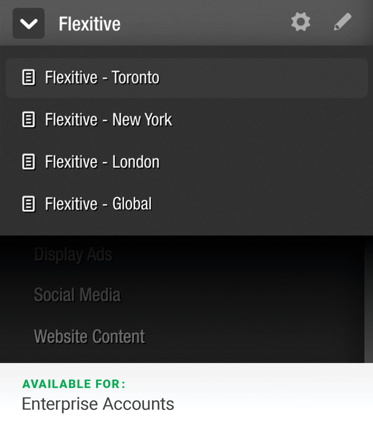
Every Flexitive account has a Design library where your designs are stored in folders and sub-folders. A Shared Library allows you to share folders with members of teams on other Flexitive sites.

For example, if Adaptive Bean has teams based in Toronto, New York and London, Adaptive Bean can create a custom Flexitive Instance for each team (eg. https://app.flexitive.com/-/Adaptive Bean-Toronto). Adaptive Bean can then create accounts for all the Adaptive Bean-Toronto users. When Adaptive Bean-Toronto has finished a design concept and needs approval, they can move the design into the Adaptive Bean Global library, and an Adaptive Bean Global user can log in to https://app.flexitive.com/-/Adaptive Bean-Global and approve the design.

Likewise, a brand can manage the design output of multiple agencies through a single Flexitive instance.

Shared libraries are available under Flexitive Enterprise subscriptions. Contact your account manager or support@flexitive.com to share one or more of your Flexitive libraries with internal teams or partners.

Learn more about Shared Libraries here.

Scale Your Designs With Dynamic Content Feeds

Dynamic Content Feeds allow you to scale your design process by connecting elements in your design to a live XML data feed. With Live Content Widgets, your design will automatically update if a change is made to the feed, guaranteeing you’re always displaying the most up-to-date information in your design.

You can connect multiple designs with your content feed, allowing you to easily update multiple designs simultaneously.

The rich possibilities of using Dynamic Content Feeds range from sporting events to inventory updates – for content, digital signage, display ads, and more.  

Learn more about Dynamic Content Feeds.

Optimize Multisize Layouts Faster

Spend more time designing and less time building sizes by using the ‘Inherit From’ option in the ‘All Sizes’ view.

When activating a size in Flexitive, the size will be activated by taking the layout of the closest matching size and adapting its layout to fit with the new size.

You can easily copy a layout from any activated size, not just the closest size. Just click the ‘Inherit From’ drop-down menu next to the size you want to activate. You’ll then be able to choose any of the sizes you’ve activated so far in Flexitive.

After choosing a size, Flexitive will take the layout from that design and force the size you’re activating to adapt that layout to their size.

Learn more about the ‘Inherit From’ option in Flexitive here.

Adding Flexitive Widgets

In Flexitive, Widgets allow you to add interactive components to your designs, such as a rotating Carousel, or a Legal Widget. Flexitive Widgets can be added to a page by clicking the ‘Rocket’ icon on the left navigation bar.

The widgets available in Flexitive are:

If a widget is not available in your account, reach out to your account manager or to a member of the Flexitive Support Team (support@flexitive.com).

You can learn more about Flexitive widgets here.

The Benefits of Web Fonts

By adding text as a web font rather than as an image, your text elements will be responsive, easy to edit, and simple to scale across sizes. Web fonts can be easily edited inside Flexitive and include a scrolling option, which is perfect for large blocks of text.

Web fonts are also very light on file size and don’t compress on export.

With Flexitive, you’ll have access to over 700 free web fonts, including Google web fonts and fonts.com fonts. With a fonts.com subscription, you can access over 22,000 web fonts. You can also choose to upload your own custom webfont.

You can choose to embed web fonts directly into your design file when exporting your design. Embedding is ideal for displaying offline designs to digital signage or platforms that don’t allow third-party calls, like Google Ads (AdWords).

To learn more, check out our article on Text as Web Fonts vs Images.

Embedding Responsive and Interactive Content

With embedded pages, you can use any Flexitive design as a live element in your design.

A responsive embedded page adapts to any size or aspect ratios it’s displayed in. The adaptive nature of embedded pages makes it easy to scale your design across unlimited sizes.

With embedded pages, you can save hours of design time and ensure consistency across your designs. Learn more about embedding responsive and interactive content here.