Adding Custom Templates

Custom templates are the perfect starting point when building a campaign in Flexitive and allow you to quickly build a campaign in minutes. You can easily add custom templates to your account using an existing Flexitive design or by building a new design.

Custom templates can be built specifically to your brand guidelines and vastly reduce the design time of your project as they require little modification.

You can also design your custom templates by categories, for example, a custom template for vacations, automotive, and dining.

Whenever you start a new project in Flexitive, your custom templates will be available in the Template Selection Screen.

Custom Templates are available under Enterprise subscriptions. Reach out to your account manager or support@flexitive.com to set up your custom templates.

Check out our article Using a Flexitive Template for more information.

Export Anywhere

With Flexitive, you can export your animated HTML5 designs in a variety of different ways. Choose the export option that bests suits the platform you’d like to display your designs on and the audience that you’d like to reach. Once exported, you can then display your animated HTML5 designs on ad servers, websites, digital signage, social platforms, and more.

Ad Servers
You can export your HTML5 file package as a ZIP file or live ‘tag’, and the latest ad server code will be automatically added to your file. Live designs exported directly from the Flexitive Design Cloud reflect changes instantly. Flexitive currently supports over 40 of the leading ad servers and is constantly adding more.

See the full list of Flexitive supported ad servers here.

CMS
Exporting your design for CMS allows you easily host your design in an iframe, or as a generic HTML5 ZIP with no tracking information for ad servers. Export your designs for CMS when you want to use your Flexitive design as an element on your website.

Learn more about exporting your designs for CMS here.

Digital Signage
With Digital Signage you can display your Flexitive designs on any sized screen, across stadiums, conference stands, menu boards, and more. Digital Signage requires a flexible design that can to adapt to any screen. Since fixed size designs cannot do this, it is recommended that designs for Digital Signage be built to be fully responsive.

For more information, check out our article on Building a Design for Digital Signage.
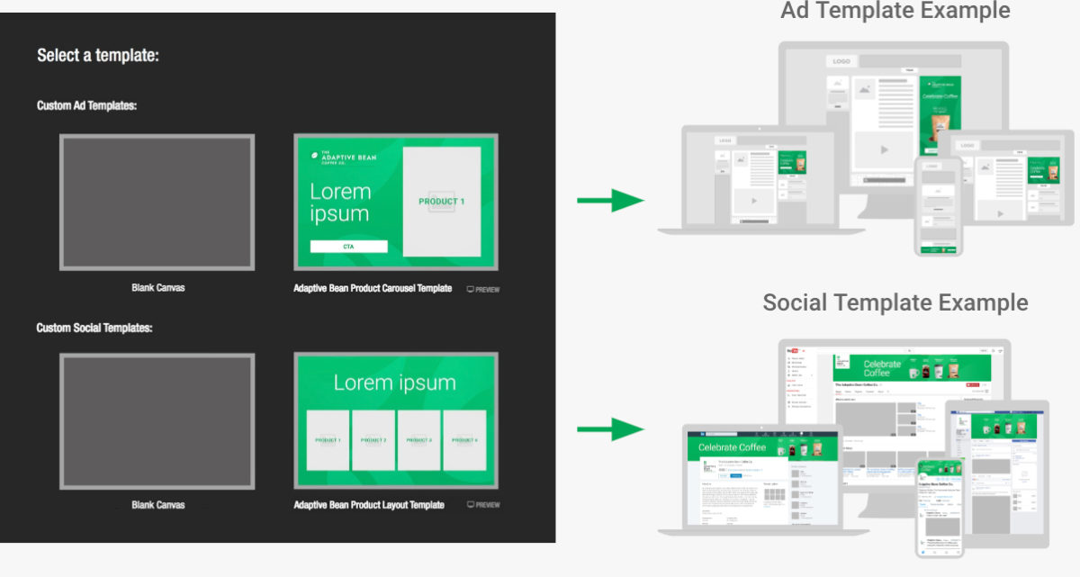
Social Media
Most social media platforms do not accept HTML5 design uploads, so when you export your design for social media you should export static JPEG images or as a video export.

For more information on exporting, check out our Flexitive Tutorial Video Exporting a Design.

Do More with Carousel Widget Transitions

The Carousel Widget is an easy and fun way to showcase hero images on your website, multiple products in your ads, upsell options at your point-of-purchase and more.

Expand your creative options by using different Carousel Widget Transitions and directions, such as Slide Up/Down or Flick.

The Carousel Widget can also be built to be fully responsive, so you can use the same widget on any size in your design project and it will still look good.

Check out our Flexitive Tutorial video on Carousel Widgets for a full guide on adding a Carousel Widget to your design.

Control Element Visibility to Scale Your Design Faster

In Flexitive, when you add a new element to your design, that element will be added to all activated sizes. By adding your elements to all activated sizes, Flexitive makes the entire design process shorter.

When editing a size, you can choose what sizes you want a newly added element to appear on. Using the Visibility settings in the Customize Panel, you can set an element to hide an on a particular size, on all other active sizes, or by portrait and landscape orientation.

You can see the elements you’ve hidden on your canvas using the ‘Show Hidden Layers’ toggle in the Layers panel.

For more information, check out our article on Element Visibility.

Locking the Aspect Ratio of a Shape

Using Aspect Ratio lock, you can control how a shape behaves as it’s re-sized, allowing you to easily and effectively scale shapes across multiple sizes. Aspect Ratio lock is particularly useful when re-sizing embedded pages and shapes.

You can set shapes in a design to either have their aspect ratio Locked or Unlocked. When the aspect ratio of a shape is Locked, the aspect ratio of the element will remain the same as you resize the bounding box. Unlocking the aspect ratio of a shape with a Locked aspect ratio will stretch the element to all edges of the bounding box.

Learn more about the Aspect Ratio of an element here

Unlocked:


Locked:

Uploading Assets to your Flexitive Design

Flexitive combines assets like video, images, and text with features that include widgets, animation, and data feeds to create fully-responsive designs that look amazing.

You can upload JPG, PNG, SVG, GIF, and MP4 assets to your designs. The formats you choose to use for your assets will depend on how the element will be used in your design. For example, JPG images are oftentimes the best option for uploads in any scenario where you are not using an image with transparency and will compress better than any other image format on export.

Other design tools can complement the work you do in Flexitive when you prepare your assets for import.

When preparing your assets for Flexitive, check out our Asset Guidelines here.


Drive Collaboration With Shared Libraries

Now brands, agencies, and partners can easily collaborate across teams and markets. With Shared Libraries, users can build, edit and export designs across different Enterprise accounts.

What is a Shared Library?

Every Flexitive account has a Design library where your designs are stored in folders and sub-folders. A Shared Library allows you to share folders with members of teams on other Flexitive sites.

For example, if Adaptive Bean has teams based in Toronto, New York and London, Adaptive Bean can create a custom Flexitive Instance for each team (eg. https://app.flexitive.com/-/Adaptive Bean-Toronto). Adaptive Bean can then create accounts for all the Adaptive Bean-Toronto users. When Adaptive Bean-Toronto has finished a design concept and needs approval, they can move the design into the Adaptive Bean Global library, and an Adaptive Bean Global user can log in to https://app.flexitive.com/-/Adaptive Bean-Global and approve the design.

Likewise, a brand can manage the design output of multiple agencies through a single Flexitive instance.

Shared libraries are available under Flexitive Enterprise subscriptions. Contact your account manager or support@flexitive.com to share one or more of your Flexitive libraries with internal teams or partners.

Learn more about Shared Libraries here.

Scale Your Designs With Dynamic Content Feeds

Dynamic Content Feeds allow you to scale your design process by connecting elements in your design to a live XML data feed. With Live Content Widgets, your design will automatically update if a change is made to the feed, guaranteeing you’re always displaying the most up-to-date information in your design.

You can connect multiple designs with your content feed, allowing you to easily update multiple designs simultaneously.

The rich possibilities of using Dynamic Content Feeds range from sporting events to inventory updates – for content, digital signage, display ads, and more.  

Learn more about Dynamic Content Feeds.

Optimize Multisize Layouts Faster

Spend more time designing and less time building sizes by using the ‘Inherit From’ option in the ‘All Sizes’ view.

When activating a size in Flexitive, the size will be activated by taking the layout of the closest matching size and adapting its layout to fit with the new size.

You can easily copy a layout from any activated size, not just the closest size. Just click the ‘Inherit From’ drop-down menu next to the size you want to activate. You’ll then be able to choose any of the sizes you’ve activated so far in Flexitive.

After choosing a size, Flexitive will take the layout from that design and force the size you’re activating to adapt that layout to their size.

Learn more about the ‘Inherit From’ option in Flexitive here.